

In the highly competitive mobile app market, you need to test as many tools as possible to attract your target audience. That said, among such tools, creating an app landing page is considered effective. It can help increase the number of leads significantly.
But in order for a landing page to do its job well, you need to know how to create a landing page that sells. That’s why we’ll take a look at the specifics of creating a mobile app landing page.
Why does a mobile app need a landing page?
Before launching, a page will help analyze audience engagement before the product itself is released, allowing you to correct bugs.
A landing page is needed during the launch of the app. It’s where the ads are converted to, so that converts download the app directly there. Thirdly, you don’t have to give up on a landing page later on because it is important to keep users interested in the app. In addition, more detailed and exclusive information can be added to the frontend, which is not available on Google Play or the AppStore.
Nevertheless, many people are hesitant to create a branding if the information about the app can be added to Google Play or AppStore. But it is important to understand that a landing page is a selling page. You can specify all the benefits and let the installation down with marketing techniques, which cannot be done on Google Play and AppStore.
Additionally, different targeting options are available on the landing page: e.g. newsletter subscription, installation of the app, receiving a bonus. Mailing subscriptions are used before the launch of the app, when you need to gather a base of interested users. They can be made aware of the app’s release by email, or you can set up targeting.
What does a selling landing page look like?
Minimalism. It means there should be as few unnecessary elements on the page as possible.
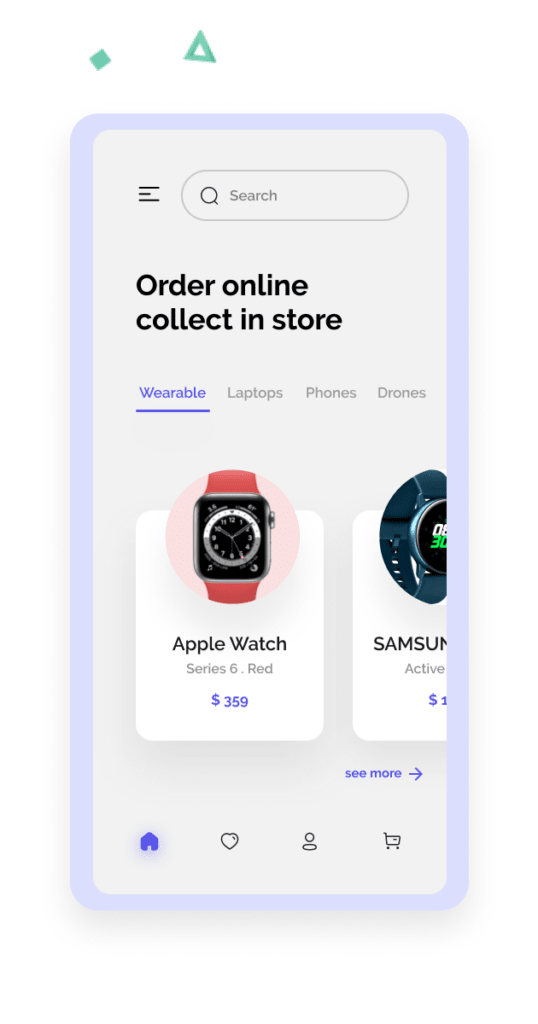
Not much text. Use more information in graphic form. A large canvas of text is unlikely anyone will read. It’s better to show clearly how the app works, and why it should be downloaded right now.
Brilliance. A mobile app is also a pretty picture. Your branding should be striking and catchy, following the style of the app itself.
Support of any devices. On the landing page users should be able to enter from any device. Make sure that the page loads quickly and that all elements are displayed correctly, regardless of device.
Informative. When the user goes to the website, they need to see what the page is about, and what it offers in particular. Also, the visitor must understand what target action is expected of him.
When these conditions are met, the landing page is more likely to bring the required number of targeted actions. So before creating a landing page for a mobile app, make sure that its layout is in line with these points.
After the goal, you need to decide on the content. For a regular website, it needs to be collected and structured: this to the home page, this to “About Us”, this to the FAQ. The main task for a landing page, especially for a mobile site, is not to structure it, but to prioritize the order in which you want to put the information.
To determine the order, you need the results of target audience analysis. You’ve identified who your target customers are, and it’s now much easier to figure out how to persuade them. It’s great if you don’t just analyse the internet, but gather the right people and talk to them in person. Find out what they care about, what problems need to be solved and how they have already tried to do it.
Don’t immediately write the content as a ready-made text. Better write out the screens based on how best to persuade the CA. For example:
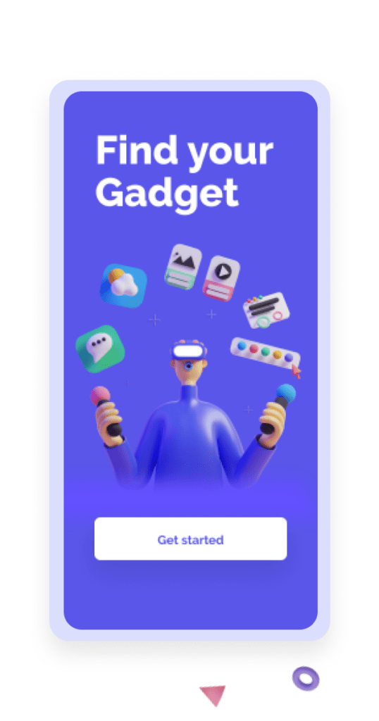
start screen – the offeror and its benefit + CTA,
description of function 1,
description of function 2 + CTA,
gallery of reviews,
price justification + CTA.
Desktop or mobile first
The big question in designing a mobile landing page is whether to do it first or design the full version first? Once upon a time, phones weren’t as functional, so websites were made primarily for computers. Phones have become more powerful, but the principle remains: make the website first, and then adapt it for mobile.
In recent years, the Mobile First approach has evolved whereby the mobile layout, which is more problematic, has to be done in the first place. And the desktop version is created on its basis, that is, the work is based on the principle of development. You don’t have to cut anything, you just have to add and enrich it.
Mobile design
Next, the prepared content must be made into a ready mobile frontend. I will tell you about a few principles and peculiarities that should be taken into account when making the layout.
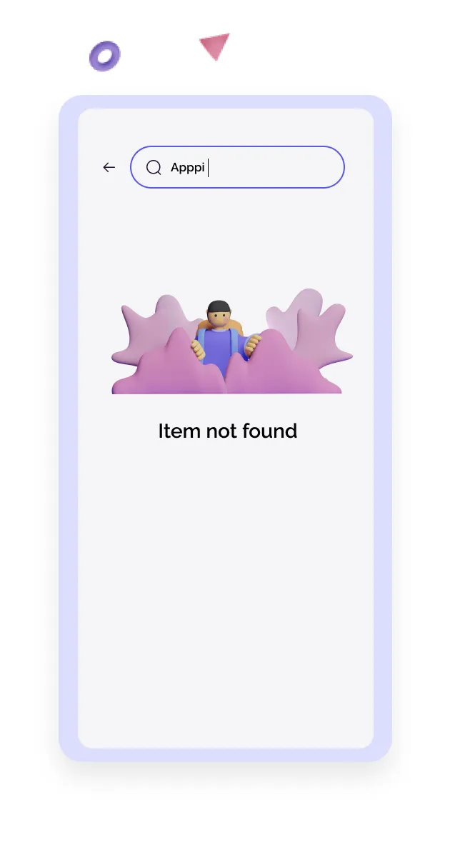
Make-up in one column. It’s better to make everything in one column. If you divide the content in two, the columns will be too narrow. You will get a lot of strange transfers in the text, or you have to make the font very small. Arrange content vertically in blocks.
Air. Elements glued together on a small screen are difficult to read. It’s better to highlight the main thing among them and layout these blocks loosely, with space between them. Do not forget about the rule of proximity: objects located next to each other are perceived as related in meaning.
“Bends”. If possible, one block, complete with a CTA, should fit exactly on the phone screen, without going beyond the “fold”. At a minimum, make sure that the meaning of the block is clear from one screen.
Familiar scripts and elements. Remember that the user is viewing the mobile landing page on the move. To make the process easier, use common elements that you don’t have to think about. For example, the three bars in the corner always open a menu. If the form contains a phone mask like +44 133 000 0000, it’s immediately clear that it’s the phone number you need to enter there.
In 99% of cases, there is no need to deviate from familiar patterns and elements. This may be justified only if you are selling design services and want to immediately show what solutions you are capable of.
Design at your fingertips. A phone is operated with one hand, usually even with one finger. Any unnecessary action is irritating to users. For example, when you have to enter numbers into a field and a text keyboard opens.
Be mindful of hand controls
- Position the elements so that you can easily reach them with your thumb.
- Select the size of the item so that it is easy to press. No tiny crosses.
- Avoid random elements in the bottom half of the screen so the user does not accidentally click on them. Don’t put two clickable elements close together.
If you consider the above tips, your mobile landing page will show a high conversion rate.


