
Banner ads are among the most ancient, renowned and still popular types of digital ads that ever existed. However much they are blamed for being the least seen and efficient and most annoying ones, they still are alive and kicking. A banner ad is a rectangular image (or an animation) meant to attract a user so much that they click on it and get redirected to the advertiser’s app or website. Not unlike any object of design, they need to be good-looking (or, according to some studies and our own expertise, they absolutely don’t!), noticeable and efficient in terms of high conversion rates.
Will the right choice of “success components” you are still able to make a banner rivaling those nice and engaging interactive formats, fight banner blindness and reach the perfect balance between CPCs and CPAs!
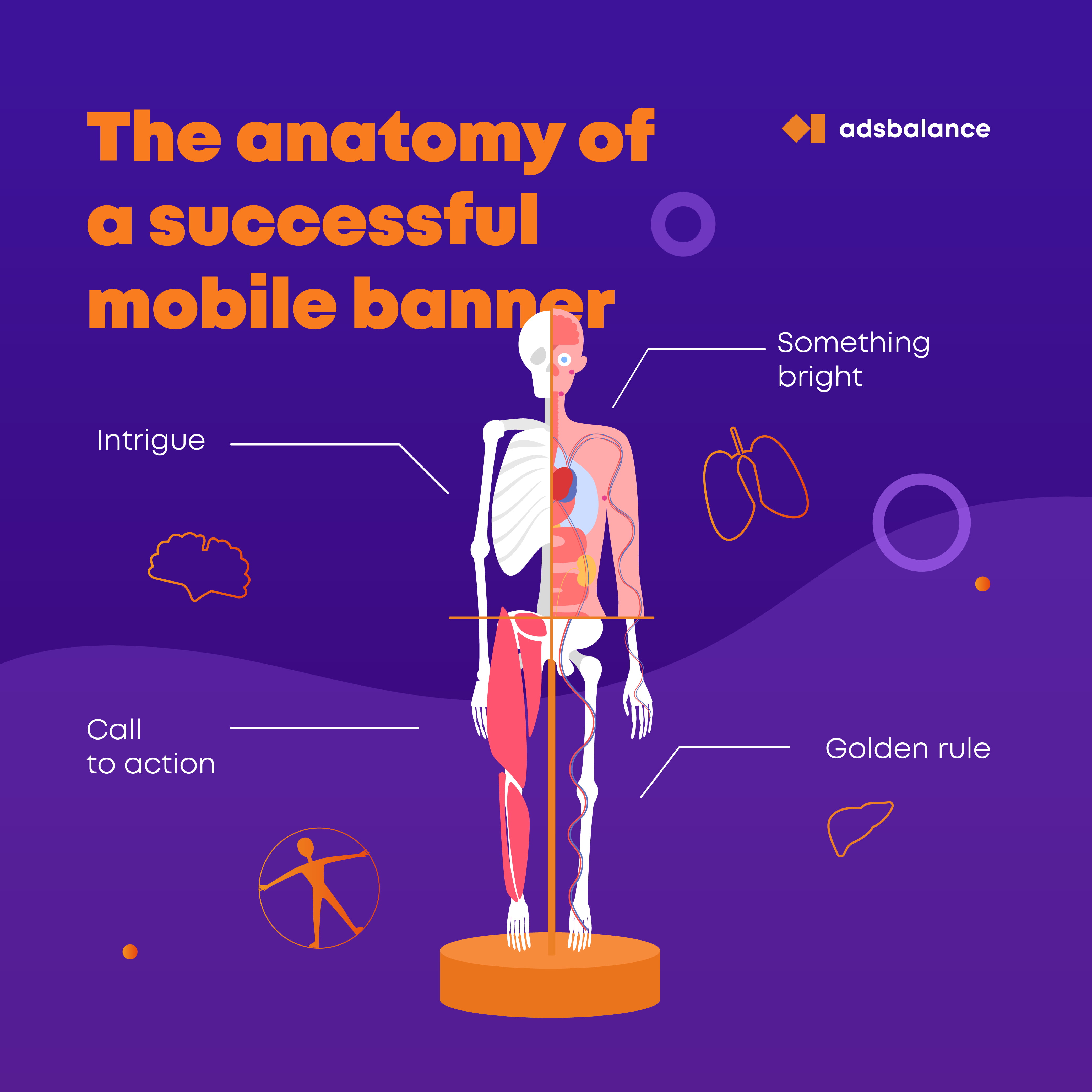
Text
Some advertisers already know it, some don’t, but text is not exactly the Holy Grail of a successful banner, or any banner at all. They say we’re becoming more and more “visual” each year, and we the effect of this on how banners work.
What are the percest text’s qualities?
2) Perfectly readable, which includes a single color base layer, the right spacing, the not-too-original font
3) Contains a call to action or a clear offer to desire instantly
4) The message is concise and does not contradict the contents of where the banner leads (the temptation to mislead users in order to gain more clicks might be quite high, and still that does not only keep your conversion on the same level but also cause a great number of users reporting your ad for false claims and even writing negative reviews, if that’s applicable
5) Make your text a part of the image (it just looks good and adds to positive perception)
Overall simplicity
The design must be clean and simple. However you are traumatized by the screams about banner blindness, you picture must not scream.
Negative user reactions will result in:
- a drop in the campaign performance
- user negative reports (to the ad network)
- higher CPM/CPC/CPA costs
Image

Try to stick to a limited number of colors
Remember what we told you about simplicity
Clean design (might not follow the material design guidelines is you don’t want it to), but still not too mannered/pretentious etc.
Don’t forget your logo! Of course, you might want to sacrifice the spare space to say an extra word or two, but will it contribute to the efficiency of your campaign? Will you lose a chance of at least raising the brand awareness at no extra cost?
Make your call to action visible. Even if the rest of the text is integrated into the image perfectly, it’s highly recommended to make your call to action a button.
Mobile-ize your banner!
However good your creative might look on a 27-inch designer’s monitor or on a bit smaller mediabuyer’s monitor, it is obligatory to view your ad in its real size, preferably on several mobile devices. Is text still readable? Do you really want a six-color palette?
If you need to zoom the text, zoom it in even if that makes you cut the symbols number?
Mobile-ize your banner pt.2
Are we HTML5 or not? Why even post plain images if you can add interactivity or animation? They say you can have a 300% boost in CTRs if you use those. But don’t overindulge in “videos” unless they are real videos: ad networks do not recommend to use more than 4 frames per banner unless you want to see a drop in user attention.
Create variations!
Even if you are 100% confident your banner is a piece of art and will work perfectly in any situation, do not grudge the time for:
creating 3-4 options for the text
for the image
for the image colors, is that’s not a photograph. We mean it: the red and green banners of the same design might convert differently, and that difference might be astonishingly great.
Last, but not least: the call to action. Positive calls to actions tend to work better, but why not try the good old “Don’t miss .. something”
In case you still didn’t get it: A/B/C/D/E test in any stiruation!
Care for where you lead to!
If your banner leads to a desktop website, make sure it’s adaptive and mobile-friendly. Also, a website must have a valid security certificate and a privacy policy, of course, if you’re not careless enough to not track your campaigns at all. If you lead to an app store, make sure your link works on any device. This piece of advice, in fact, is universal: just make sure your link works.
As we have already mentioned, the contents of the end page must somehow correspond with what you see on the banner.
Do you have any recommendations for creating and running moble banner ads?
You’re welcome in the comments section!
We have our own in-house design team. Drop us a line, and Adsbalance team will help you create effective marketing campaigns.


