The mobile ads market is growing every year, the mobile ad spends have surpassed TV spends as long ago as in 2018, and the share of mobile ads (among all of the existing types) is long past 70%. Advertisers have been excited with “mobile” for much longer: we remember the conferences in 2014 where our colleagues tried to persuade the brands they must start buying smartphone ads right away, but the market needed some time for the evolution to happen in flesh and soul. That is why any advertiser, whatever product they have, must know all of the existing opportunities to merely not become aliens from Mars. Mars the fourth planet, of course.To start with, we need to define what mobile ads are. It’s as simple as it seems: they are any ads that you have a chance to see on your mobile device, including tablets. In this article we are going to talk about ads created for (or adapted) mobile devices in the first place, before the launch of the campaign. So let’s go!
SMS ads
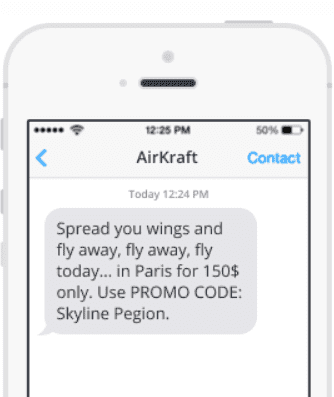
As freaky as it sounds in 2021 and in this list, the type meets the criteria and still exists. We do not talk about spam: it’s still ads, but is illegal in most counties (if the client has not given their consent for receiving this specific type of ads) We believe that you still see such messages as shown in the picture above and do not consider them a huge problem, as long as the information in text is just a bit relevant. Decent sms ads are usually for the existing company clients, you might want to warm them up by reminding of yourself or tell them about your special offers.
This function is very close to mailouts, with two basic differences: you the number of symbols you can use is really, really limited (that might be seen as a drawback, but will you argue that brevity is the soul of wit?), and, on the other hand, you can send users directly to your application, or encourage to download it, if you have one.
Push notifications
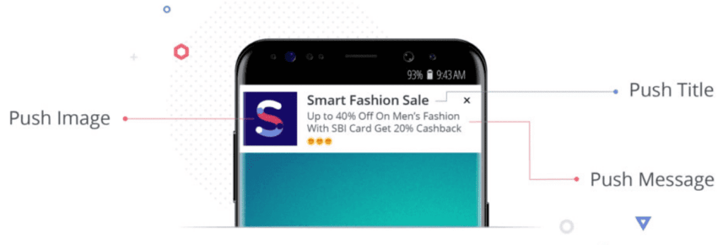
This is the very straightforward format, almost as the one with sms, although not all of the advertisers do know that and often shun this kind of placements.
Push notification is a short message containing an image (usually square), a headline (up to 30 symbols) and a short message (up to 75 symbols). It can be sent by any app that has access to the notifications. Another thing is the notifications sent by various websites via your browser of choice if a user has opted in for receiving messages from them.
To make use of that small number of symbols, you need strong words (also called power words) to provoke user emotions. State your offer very clearly: basically, the offer is all there must be.
Banner ads (web)
The oldest (almost ancient, in fact, category) and still the largest ad category with the biggest spend across all mobile placements. Originally they come from web banners transferred to mobile devices. Almost any banner consists of an image an the on-image text, traditionally, the text percentage must be lower than the image’s (Facebook had been long known for simply forbidding the images where the quantity of the text exceeds the recommended amount, but they have recently abolished the much-feared rule.
Here we speak of the banners that appear on the websites, though there are other use cases, which we will speak about later.
On-page banners
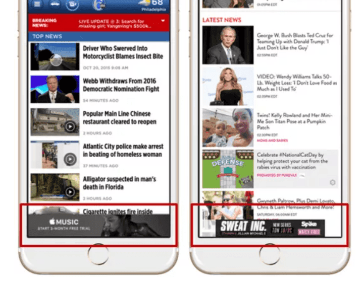
Appear somewhere on the page, usually interfering with page content, but only slightly due to small size. Typically, they are either on the top of the page or border the low margin of the page. The original page contents are not shaded, so banners coexist with them.
They are considered to be cheap (though you might be surprised by the CPMc if you try to buy directly from the top-50 websites in your regions)
Interstitial banners
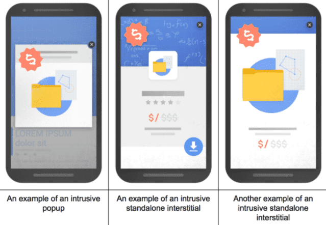
They might come as videos, click to play or autoplay
The one great difference between a standard banner and this type is its fullscreen-ness. The original idea was to show fullscreen banners that appear before page open or on transition between website pages. However, some major ad networks (like Google AdMob) invented a format where advertisers do not have to “paint” or “design” banners: they offer a sort of constructor where you only have to upload your text and logo to fill in the template. The result will be shown (usually) as a white block, usually smaller than the page size, at the center of the page with all of the page contents dimmed. They are said to convert much better than the regular banners, but are ofter considered intrusive, so the advertiser and the website (content) owners must keep the balance between the income and the user satisfaction.
HTML5
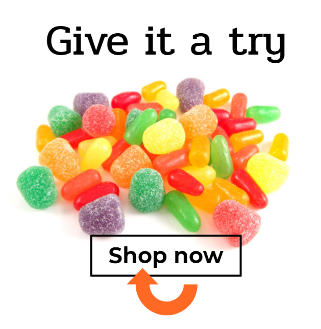
Technically, any moving thing on mobile must comply with the HTML5 standard, but we are going to use the term to describe all things interactive. It’s the Flash for mobile, roughly speaking. As follows from its name, the format allows users to take actions while looking on the banner: unlock the boxed, move the clouds away from the sun, erasing the opaque cover from the coupon ticket the almost real way.
However, it does not necessarily have to be something outstanding: many advertisers use html5 banners for creating images with a separate call to action button, and those creatives are still very efficient.
Video ads
In fact, all of the videos must be HTML-5 compatible to run on mobile, also, you may need some tricks to make your ads autoplay. Apart from the difficulties, this fact provides some perks, like making the video interactive too, and we know that this alone is considered the most efficient format, imagine what happens when you add some action?
Native ads
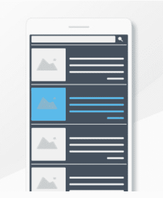
Mobile (but can be desktop as well) ads that imitate the page’s real content, be it texts or videos.
InRead ads
Video (or interactive) ad that appears right inside the page content, it might slide the text apart, or, as an option, you can reveal the ad content by scrolling, like drawing curtains. The name derives from the ad invented as an invigorating addition to long-text pages.
In-app ads
A big family of ad types, almost all of which somehow copy the “web” formats. The format itself does not matter as much as ad frequency and the moment when the ad appears. Usually in-app ads are the preferable mobile format, since the tracking options are much more sophisticated and precise.
Banners (over the content) — a rare and rather unwelcome format due to its strong interference with app visual style and the distraction it provides. That is why they are sometimes non-efficient for being both annoying and not attention-grabbing enough.
Interstitial banners and videos. Usually launched after completing an app usage stage, like a round in a game
Playable ads — evidently, used for adverising games. Super-efficient format that allows users to try and play the promoted game. Looks cool, works cool, and if there’s an ability to close, the users are not even annoyed.
Pre-roll (mid-roll, post-roll, etc)
If an app has video content of its own, the ad is inserted before (or after, or in the middle of) the video.Google Play/App Store/other stores native formats. Just remember they exist
We have experience working with all of these Mobile ads, check our list of expertise.
Do you agree with the systematics we provided. Have you got anything to add? If so, welcome to the comments section!

